
Charts
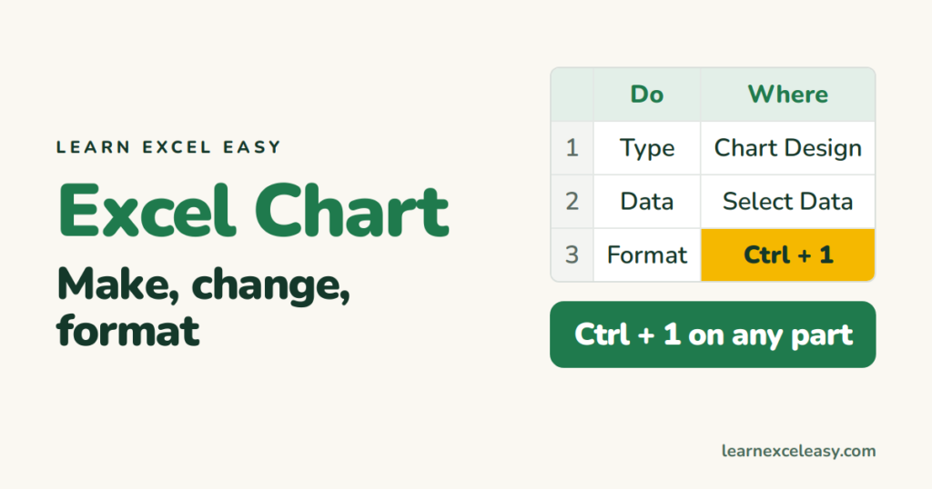
Excel Chart: make one, change its type, and format every part
The Excel chart reference: make a chart, change its type, edit the data range, format axes, colours, labels and gridlines, copy a style, and export it.
The Excel chart reference: make a chart, change its type, edit the data range, format axes, colours, labels and gridlines, copy a style, and export it.
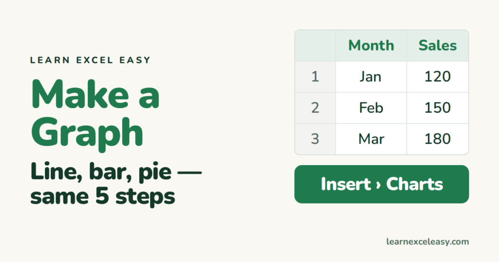
How to make a graph in Excel step by step: set up the numbers, select them, insert the graph type, add a title and labels, and fix the three things that usually go wrong.
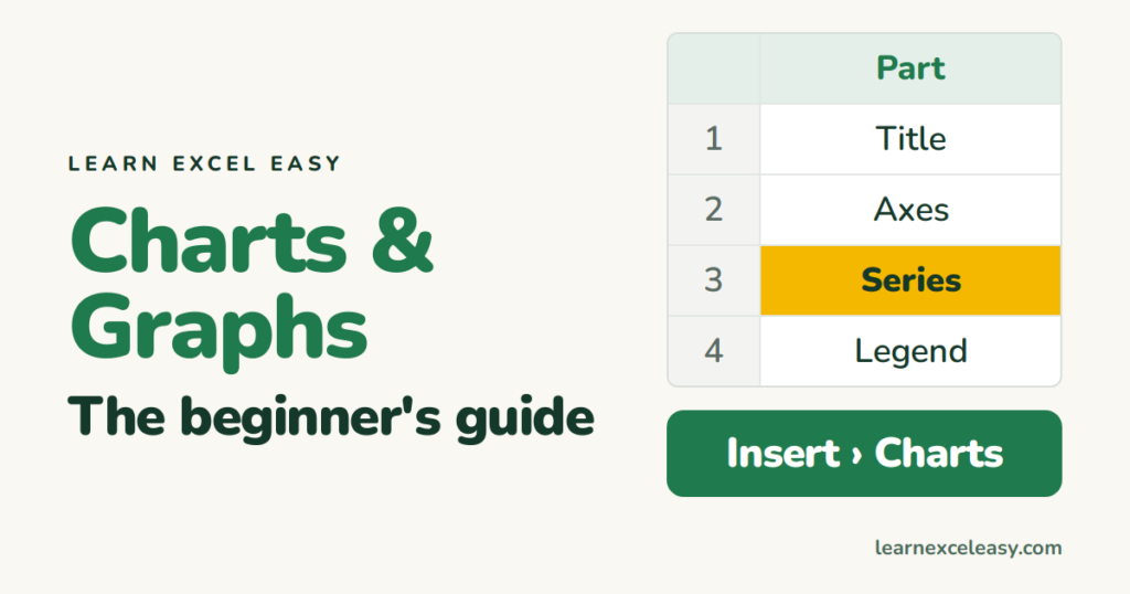
Excel charts and graphs for beginners: chart vs graph, the parts of a chart, how to make one in 5 steps, the 6 types you need, and the fixes for the common problems.
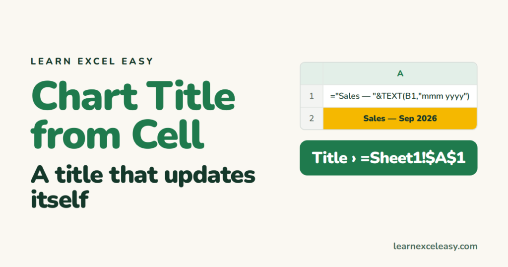
Link an Excel chart title to a cell so it updates when the cell changes — including a title built from a formula with the month or total inside it.
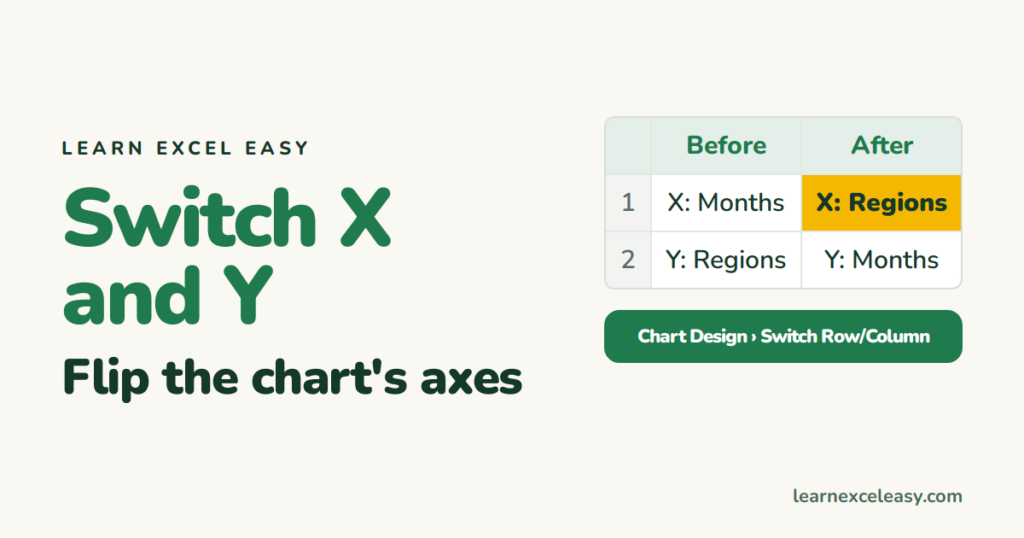
Switch the X and Y axis in Excel: Switch Row/Column for bar and line charts, swap the series values for a scatter plot, and flip a bar chart's direction.
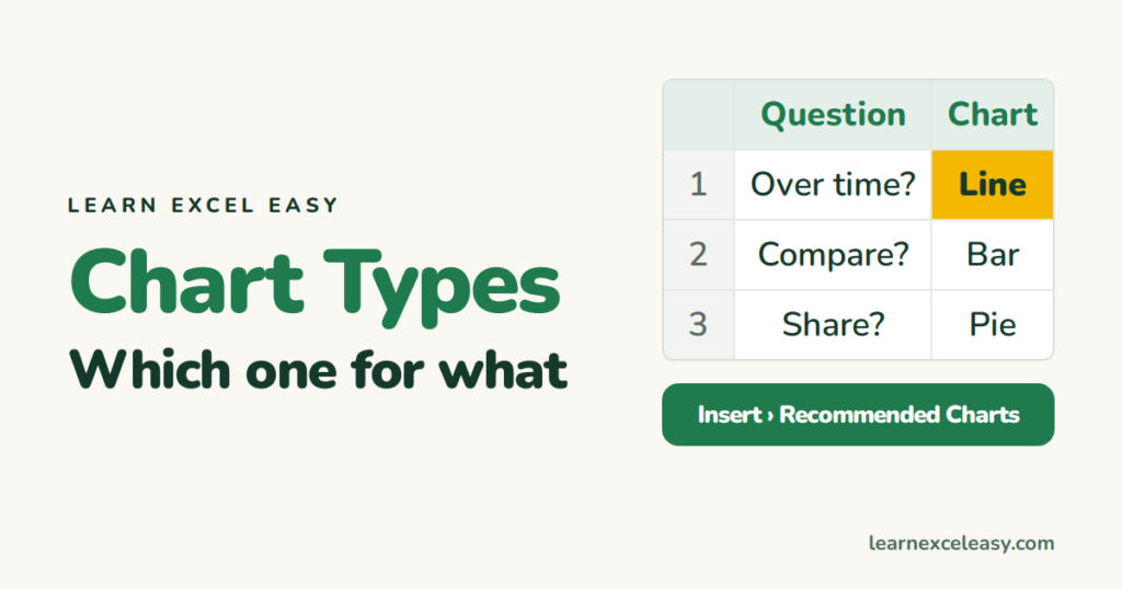
The Excel chart types that matter — column, bar, line, pie, scatter, stacked, combo, Gantt — and a one-line rule for choosing each.
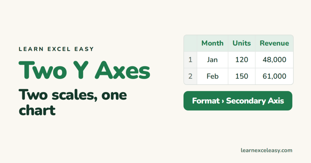
Put two series with different scales on one Excel chart using a secondary Y axis, label both axes, and fix bars that hide behind each other.
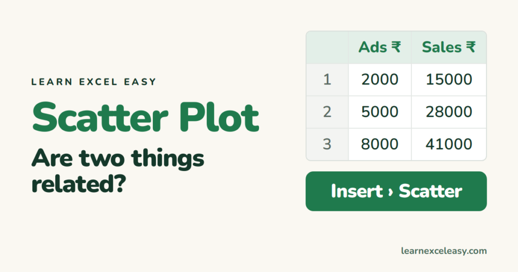
Make a scatter plot in Excel, add a trendline and its equation, label the points with names, and read what the pattern means.
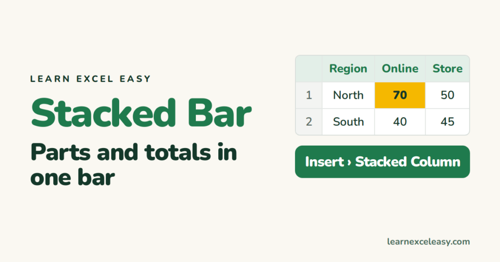
Make an Excel stacked bar chart, show totals on top of each bar, switch to 100% stacked for shares, and know when clustered bars work better.
One short Excel lesson in your inbox every morning. Free, no spam, unsubscribe any time.
Also join us on Facebook
