
Excel Chart: make one, change its type, and format every part
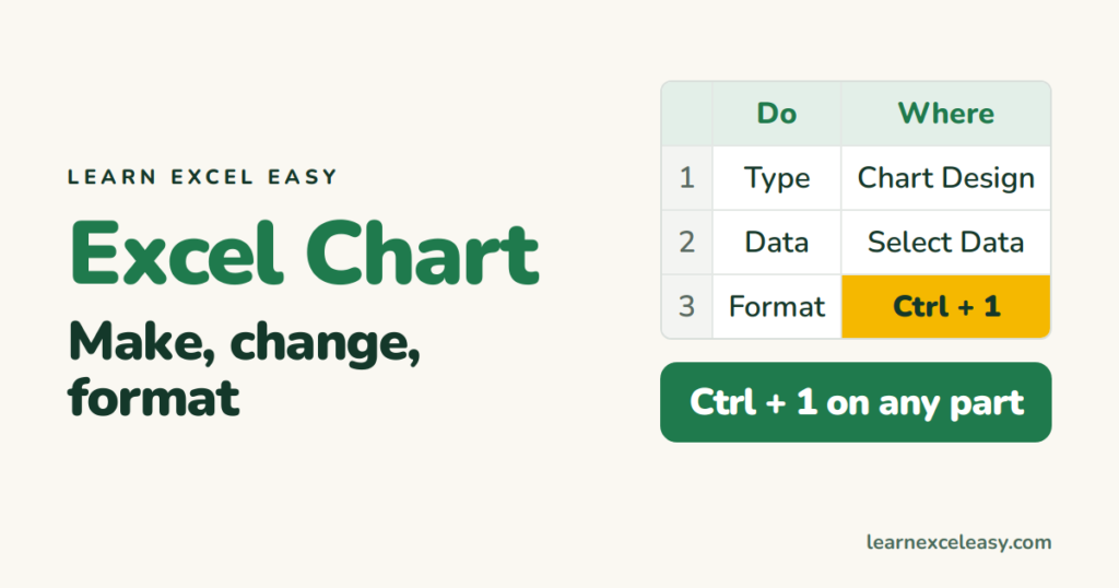
Once a chart exists, everything you might want to change is in one of three places: the Chart Design tab, the + button, or Ctrl + 1 on the part you clicked.
Make one
Select the data › Insert › pick a type. Five-step version: create a chart.
Change the type
Right-click the chart › Change Chart Type. Data stays.
Change what data it uses
Right-click › Select Data. Add or remove series, edit ranges, Switch Row/Column. Or drag the coloured range outline on the sheet to a new area.
The + button (show/hide parts)
Click the chart › + : Axes, Axis Titles, Chart Title, Data Labels, Data Table, Error Bars, Gridlines, Legend, Trendline. Tick or untick.
Format any part: click it, Ctrl + 1
| Click | Then you can |
|---|---|
| Axis numbers | Min/Max, number format, reverse order, log scale |
| A bar or line | Fill/colour, width (Gap Width), markers, secondary axis |
| One bar (click twice) | Colour just that bar |
| Data labels | Position, number format, value from cells |
| Chart area | Background fill, border, rounded corners |
| Legend | Position: top, right, bottom |
Quick styles
Chart Design › Chart Styles and Change Colors. Pick a plain one; the 3-D ones distort.
Copy one chart’s look to another
Ctrl + C the good chart, select the other, Home › Paste ▾ › Paste Special › Formats.
Save a style as a template
Right-click › Save as Template. Later: Insert › Recommended Charts › All Charts › Templates.
Export
Right-click › Save as Picture (PNG). Or copy and paste into Word/PowerPoint. Details.
Check it worked
Hover any bar or point — the tooltip shows the category and value you expect.
Every chart lesson
Charts and graphs guide · Which type · Line · Bar · Pie · Stacked · Scatter · Combo · Gantt · Two axes · Switch axes · Title from cell

20 years with spreadsheets and enterprise systems. Writes one short, plain-English Excel lesson a day. Got an Excel question? learnexceleasycom@gmail.com
