
How to Create a Chart in Excel: the 5-step method for any chart
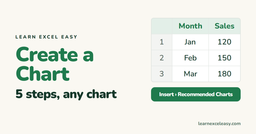
Every chart in Excel is made the same way. Learn the five steps once and you can make any of them.
Step 1: arrange the data
Labels in the first column, numbers in the next column(s), one heading per column, no blank rows.
| A | B | |
|---|---|---|
| 1 | Month | Sales |
| 2 | Jan | 120 |
| 3 | Feb | 150 |
| 4 | Mar | 180 |
Step 2: select it
Click A1, Shift + click B4 — headings included.
Step 3: pick the type
Insert › Recommended Charts shows Excel’s guesses. Or choose directly:
| Question | Chart |
|---|---|
| How did it change over time? | Line |
| Which is biggest? | Bar / Column |
| What share of the total? | Pie (≤6 slices) |
| Two things related? | Scatter |
| Parts and totals together? | Stacked column |
Step 4: title and labels
Click the title, type. Click the chart › + › tick Data Labels, Axis Titles as needed.
Step 5: tidy
Delete the legend if there is only one series. Remove gridlines if they add nothing. Make the axis start at 0.
Move or resize
Drag the chart by its edge. Drag a corner handle to resize. To move it to its own sheet: right-click › Move Chart › New sheet.
Check it worked
Change a number in column B. The chart updates by itself.
Next

20 years with spreadsheets and enterprise systems. Writes one short, plain-English Excel lesson a day. Got an Excel question? learnexceleasycom@gmail.com
