
Excel Chart Types: which one to use for what (with examples)
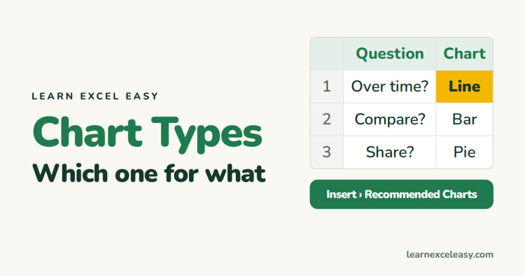
Excel offers 17 chart families. You need six. Choose by the question the chart answers.
| The question | Chart | Example |
|---|---|---|
| How did it change over time? | Line | Monthly sales |
| Which category is biggest? | Column (vertical) / Bar (horizontal, long labels) | Sales by region |
| What share of the whole? | Pie — max 6 slices | Budget split |
| Parts and totals? | Stacked column | Online + store per region |
| Are two numbers related? | Scatter | Ad spend vs sales |
| Two different scales? | Combo (bars + line, two axes) | Units and revenue |
| A schedule? | Gantt (a stacked bar in disguise) | Project timeline |
Types to avoid
- 3-D anything — the perspective distorts the values.
- Doughnut, radar, funnel — harder to read than a bar chart of the same data.
- Pie with more than 6 slices — use a bar.
- Area — lines are clearer unless you are stacking totals.
Not sure? Let Excel guess
Select the data › Insert › Recommended Charts. It ranks the sensible ones first.
Change the type after the fact
Right-click the chart › Change Chart Type. Data stays, only the picture changes.
Lessons for each
Line · Bar · Pie · Stacked · Scatter · Combo · Gantt · The 5-step method

20 years with spreadsheets and enterprise systems. Writes one short, plain-English Excel lesson a day. Got an Excel question? learnexceleasycom@gmail.com
