
Excel Pie Chart: make one and label it properly
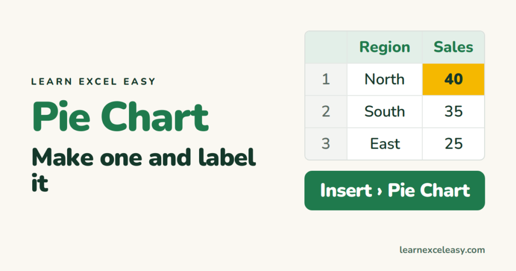
A pie chart shows how a total splits into parts. Use it when you have one set of numbers that add up to a whole — sales by region, votes by option.
What you will make
A pie chart of sales by region with percentage labels on each slice.
Steps
- Put labels in column A and numbers in column B, with a heading row.
- Select both columns including the headings (A1:B4).
- Go to Insert › Charts › Pie and choose the first 2-D pie.
- Click the chart. Click the + button beside it and tick Data Labels.
| A | B | |
|---|---|---|
| 1 | Region | Sales |
| 2 | North | 40 |
| 3 | South | 35 |
| 4 | East | 25 |
Show percentages instead of numbers
- Right-click any data label › Format Data Labels.
- Tick Percentage, untick Value.
- Tick Category Name too, so each slice says “North 40%”. Then delete the legend.
Change the title
Click the chart title once, type the new one, press Enter.
Pull one slice out
Click the pie once, then click the slice you want. Drag it slightly away from the centre.
When not to use a pie
More than 5 or 6 slices, or numbers that do not add up to a total — use a bar chart. People compare bar lengths far better than slice angles.

20 years with spreadsheets and enterprise systems. Writes one short, plain-English Excel lesson a day. Got an Excel question? learnexceleasycom@gmail.com
