
Excel Chart with Two Y Axes (secondary axis in 4 clicks)
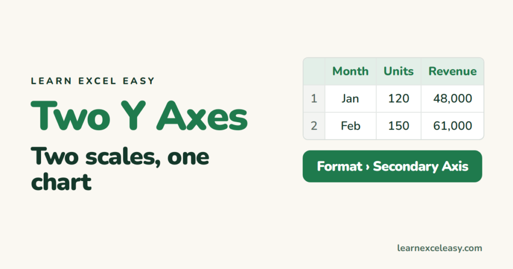
Units in the hundreds and revenue in the tens of thousands — on one axis the units line is flat on the floor. Give it its own axis.
Steps
- Select the data (Month, Units, Revenue with headings). Insert › Line Chart.
- Click the series that looks flat (Units).
- Press Ctrl + 1. Under Series Options choose Secondary Axis.
- A second axis appears on the right, scaled to Units.
Label the axes so nobody guesses
Click the chart › + › Axis Titles › tick both. Type “Units” on the right one, “Revenue ₹” on the left.
Bars and a line
If Revenue should be bars: right-click the chart › Change Chart Type › Combo › Revenue: Clustered Column, Units: Line, tick Secondary Axis for Units. Full lesson: combo chart.
Two bar series, one hides the other
Bars on primary and secondary axes overlap. Make both lines, or use the combo approach with one as a line.
Start both axes at zero
Click each axis › Ctrl + 1 › Minimum 0. Otherwise the two scales exaggerate different things.
Check it worked
Both series fill the chart height; the right axis numbers match the Units column, the left match Revenue.

20 years with spreadsheets and enterprise systems. Writes one short, plain-English Excel lesson a day. Got an Excel question? learnexceleasycom@gmail.com
