
How to Switch the X and Y Axis in an Excel Chart
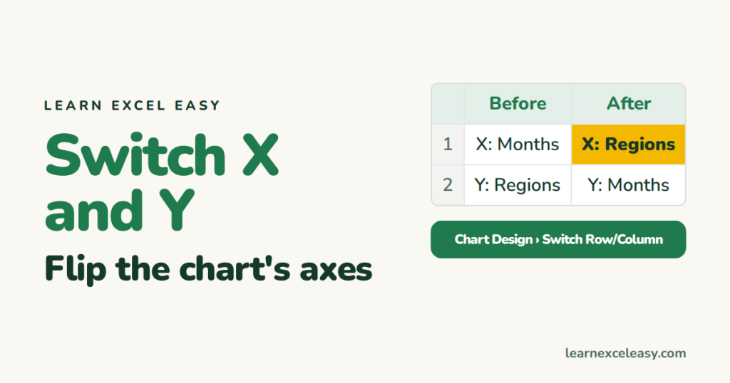
“Switch the axes” means one of three things. Find yours.
1. Bar, column or line chart: categories and series are the wrong way round
Months are along the bottom but you wanted regions.
- Click the chart.
- Chart Design › Switch Row/Column.
What was on the axis moves to the legend and vice versa.
2. Scatter plot: X and Y values swapped
- Right-click the chart › Select Data.
- Select the series › Edit.
- Cut the range from Series X values, paste into Series Y values, and the other way round. OK.
3. Turn a column chart into a bar chart (vertical → horizontal)
Right-click the chart › Change Chart Type › Bar › Clustered Bar. The value axis moves from the left to the bottom.
Reverse the order of an axis
Click the axis › Ctrl + 1 › tick Categories in reverse order (or Values in reverse order).
Move the value axis to the other side
Click the axis › Ctrl + 1 › Labels › Label Position: High.
Check it worked
Hover a bar or point. The tooltip names the category and value you expect on each axis.
Common mistake
Switch Row/Column is greyed out — the chart is a scatter (use method 2) or a pivot chart (change the pivot’s field layout instead).

20 years with spreadsheets and enterprise systems. Writes one short, plain-English Excel lesson a day. Got an Excel question? learnexceleasycom@gmail.com
