
Excel Combo Chart: bars and a line on one chart
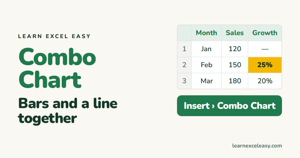
Sales in the hundreds, growth in percent — they cannot share one axis. A combo chart puts bars on the left axis and a line on the right.
What you will make
Monthly sales as columns, growth % as a line on its own axis.
Steps
- Month in A, Sales in B, Growth in C, headings in row 1.
- Select A1:C13.
- Insert › Charts › Combo (the icon with bars and a line) › Clustered Column – Line on Secondary Axis.
- Excel usually guesses right. If not: right-click the chart › Change Chart Type › at the bottom, set Sales to Clustered Column, Growth to Line, and tick Secondary Axis for Growth only.
- Click the title and name it.
Two settings that make it readable
Right axis as percent. Click the right-hand axis › Ctrl + 1 › Number › Percentage, 0 decimals.
Markers on the line. Click the line › Ctrl + 1 › Marker › Built-in › circle, size 7.
Check it worked
The tallest bar matches the biggest sales number; the line’s highest point matches the biggest growth %. If the line hugs the bottom, it is on the wrong axis — redo step 4.
Common mistake
Putting both series on the secondary axis. Only the one with the different unit goes there.

20 years with spreadsheets and enterprise systems. Writes one short, plain-English Excel lesson a day. Got an Excel question? learnexceleasycom@gmail.com
