
Excel Bar Chart: make one, sort the bars, and label them
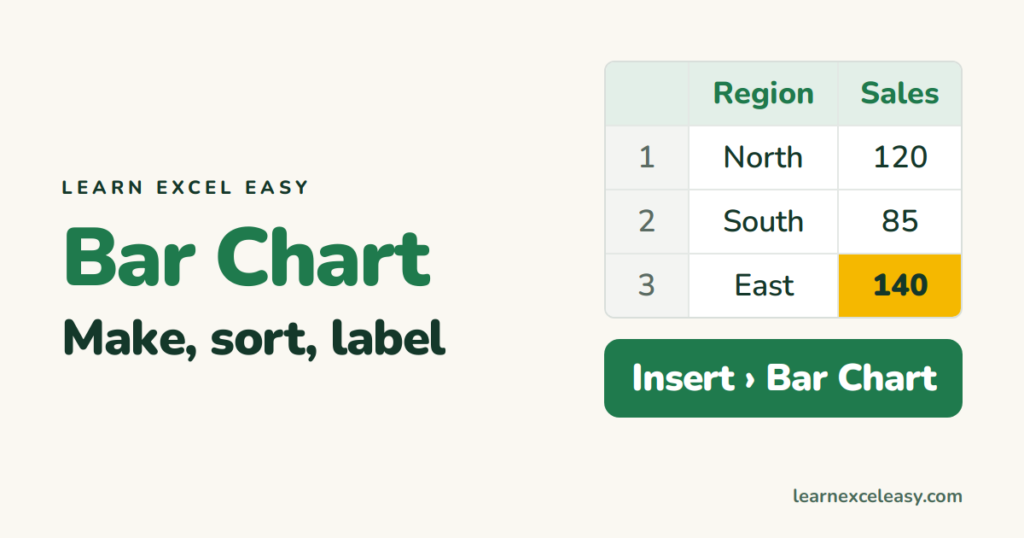
Bars are the chart people read most accurately. Use one to compare categories — regions, products, people.
Steps
- Labels in column A, numbers in column B, headings in row 1.
- Select A1:B4.
- Insert › Charts › Bar › Clustered Bar (horizontal). For vertical bars pick Column.
- Click the title and type your own.
Biggest bar on top
Horizontal bar charts list bottom-up, so sort your data ascending (smallest first) and the biggest lands at the top. Or: click the category axis › Ctrl + 1 › tick Categories in reverse order.
Add the numbers
Click the chart › + › tick Data Labels.
Colour one bar differently
Click any bar (all select), click the one bar again (only it selects), right-click › Fill › pick a colour. Good for highlighting your own region.
Make the bars thicker
Click a bar › Ctrl + 1 › Gap Width › 50%.
Bar vs column
Long labels (product names) → horizontal bars, labels stay readable. Time on the axis (months) → vertical columns.
Check it worked
The longest bar matches the biggest number in column B.
Common mistake
Starting the value axis above zero exaggerates differences. Click the axis › Ctrl + 1 › Minimum 0.

20 years with spreadsheets and enterprise systems. Writes one short, plain-English Excel lesson a day. Got an Excel question? learnexceleasycom@gmail.com
