
Excel Histogram: show how values are spread across ranges
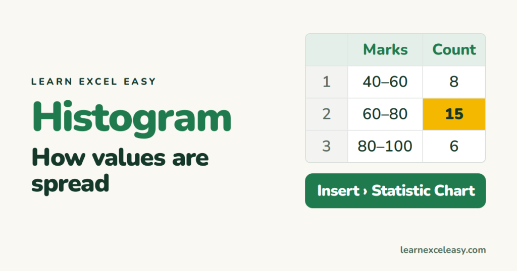
A column chart compares categories. A histogram shows how numbers are spread: how many students scored 40–60, 60–80, 80–100.
The built-in histogram (Excel 2016 and later)
- Select the column of numbers (just one column).
- Insert › Insert Statistic Chart › Histogram.
Excel picks the bins for you.
Set your own bins
Right-click the horizontal axis › Format Axis:
- Bin width — e.g. 10 for bins of 10 marks.
- Number of bins — e.g. 5.
- Overflow bin — everything above 90 in one bar.
- Underflow bin — everything below 40 in one bar.
Round, sensible bins (10, 20, 50, 100) make the chart easier to read.
With a formula: FREQUENCY
Upper limits of each bin in D2:D6 (50, 60, 70, 80, 100). Select E2:E7 and enter:
=FREQUENCY(B2:B200,D2:D6)
In Excel 365 it spills on its own; in older versions press Ctrl+Shift+Enter. The extra last cell counts values above the top limit. Plot the counts as a column chart with gap width 0.
Or with COUNTIFS
Count between two limits: =COUNTIFS(B:B,">="&C2,B:B,"<"&D2). See COUNTIFS.
Reading it
- One hump in the middle — most values are typical.
- Long tail to the right — a few very large values (common with sales or salaries).
- Two humps — you probably have two groups mixed together.
Other charts: chart types · make a chart

20 years with spreadsheets and enterprise systems. Writes one short, plain-English Excel lesson a day. Got an Excel question? learnexceleasycom@gmail.com
