
Excel Charts and Graphs: the complete beginner’s guide
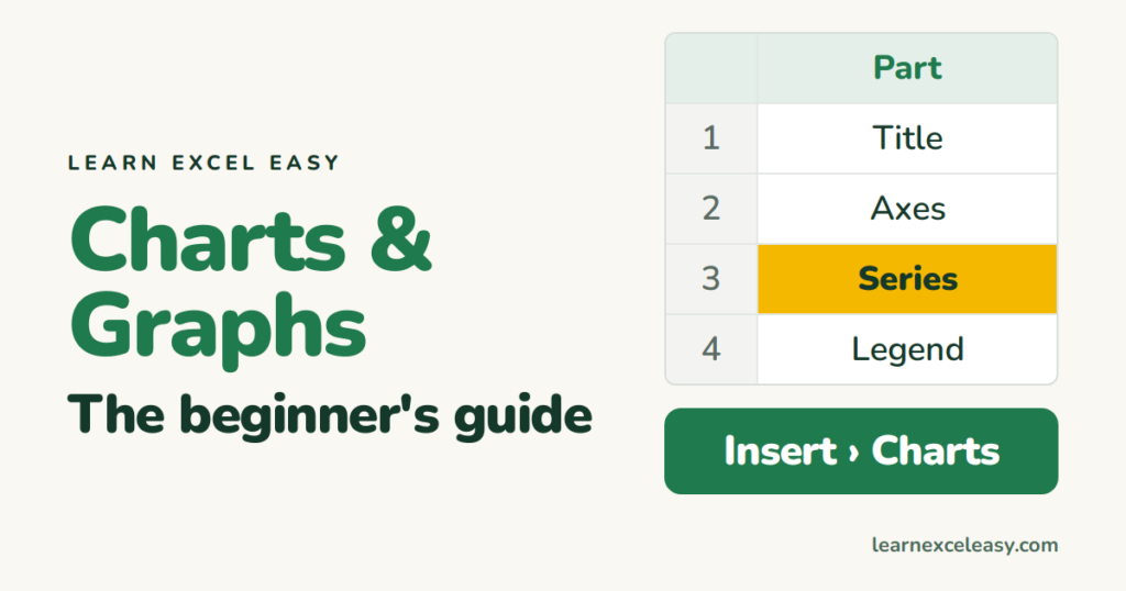
Chart or graph? In Excel they are the same thing and the menu says Charts. This page is the map; each link is a short lesson.
The parts of a chart
- Title — what it shows.
- Axes — horizontal (categories or time) and vertical (values).
- Series — one set of numbers: one line, one colour of bars.
- Legend — which colour is which series.
- Data labels — the numbers on the bars or points.
- Gridlines — the faint lines behind.
Click any part to select it; press Delete to remove it; Ctrl + 1 to format it.
Make one in 5 steps
Arrange the data › select it › Insert › pick the type › title and label › tidy. Full walkthrough: create a chart.
The 6 types you need
| Type | Use for | Lesson |
|---|---|---|
| Line | Change over time | → |
| Bar / Column | Comparing categories | → |
| Pie | Share of a whole (≤6 slices) | → |
| Stacked | Parts and totals | → |
| Scatter | Two numbers related? | → |
| Combo | Two scales on one chart | → |
Choosing between them: chart types.
Common fixes
- Axis starts above zero → click axis › Ctrl + 1 › Minimum 0.
- Wrong things on the axis → Chart Design › Switch Row/Column.
- Title goes stale → link it to a cell.
- One series is flat → give it a second axis.
- Chart didn’t update → it points at a fixed range; make the data a Table (Ctrl + T).
Move a chart to its own sheet
Right-click the chart › Move Chart › New sheet. Good for printing full-page.
Copy a chart’s look to another chart
Copy the good chart › select the other › Home › Paste ▾ › Paste Special › Formats.

20 years with spreadsheets and enterprise systems. Writes one short, plain-English Excel lesson a day. Got an Excel question? learnexceleasycom@gmail.com
